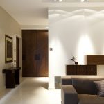
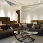
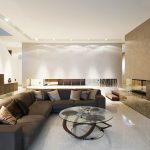
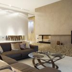
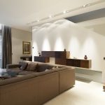
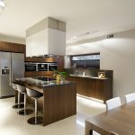
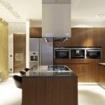
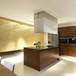
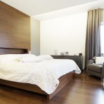
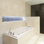
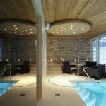
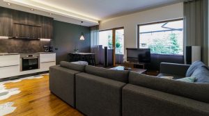
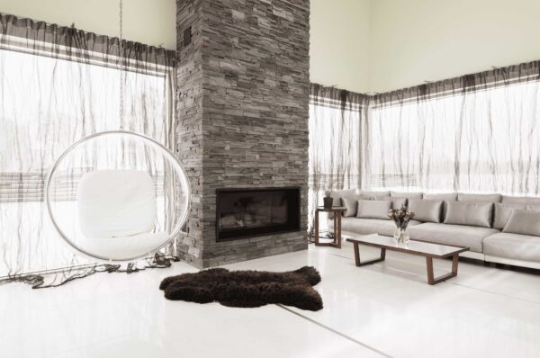
This house under the pines in Nõmme is a large family home. In addition to three bedrooms, a bathroom, kitchen and living room, there is a wardrobe, utility room, spa, wine cellar and an underground garage.
Solution
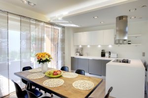
With this project, we had to start from the blueprints. We mapped out all the interior design plans before we even had received a building permit. After we acquired that and the architect had done the final changes, we could put our plans in motion. This was not the clients’ first home so they already had experience of what it would entail. They had also gathered some ideas and thoughts of what they like and the dos and don’ts. There is a foyer, living room and a utility room on the first floor. The kitchen is next to the living room and the two are separated by a wall and a glass door since the family did not wish for an open kitchen. There are a few stairs from the living room into the kitchen given that it is a little higher than the former. Both these rooms are very family friendly and cosy but just to give a more airy and open feel to them, there were two indoor windows put into the wall separating the two rooms. The windows are lined up with the fireplace and cupboards on the living room side.
Since the wall of the fireplace wasn’t at a perfect 90-degree angle, it took a little more time to find a solution but we found one that worked perfectly in this architectural setting. The first floor is covered with a stone floor because there was a little Yorkshire terrier in the family.
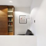
The second floor of the households three bedrooms, a walk-in wardrobe and a bathroom. As a great collaboration between the architect and the interior designer, a convenient shaft connects the second-floor bathroom and the first-floor utility room so all the laundry can be just thrown down the shaft.
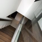
The goal was to keep the connecting stairs between two floors as unnoticeable as possible so it wouldn’t disrupt comfort of living room lounging. We found the solution in a stair hall. Meaning the stairs would be covered on both sides with partitions. To add air and excitement we put in windows.
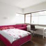
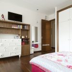
For the teenage girl inhabiting the second-floor bedroom, we had a romantic and feminine custom furniture made.
As per the clients’ wishes, all the materials were of the finest quality. The central colour scheme was warm hazelnut contrasted by stone, glass and fabrics. We also used decorative colours to make it homier and painted an accent wall in the kitchen gold.
To bring this big house together, Palazzo designed its own insignia for the house and used it throughout the building. For example, we designed a stainless steel doorknob in the shape of the insignia and also used the same pattern on cupboard doors and glass doors (that was also a safety reason!)

